Who are you rooting for?


We are
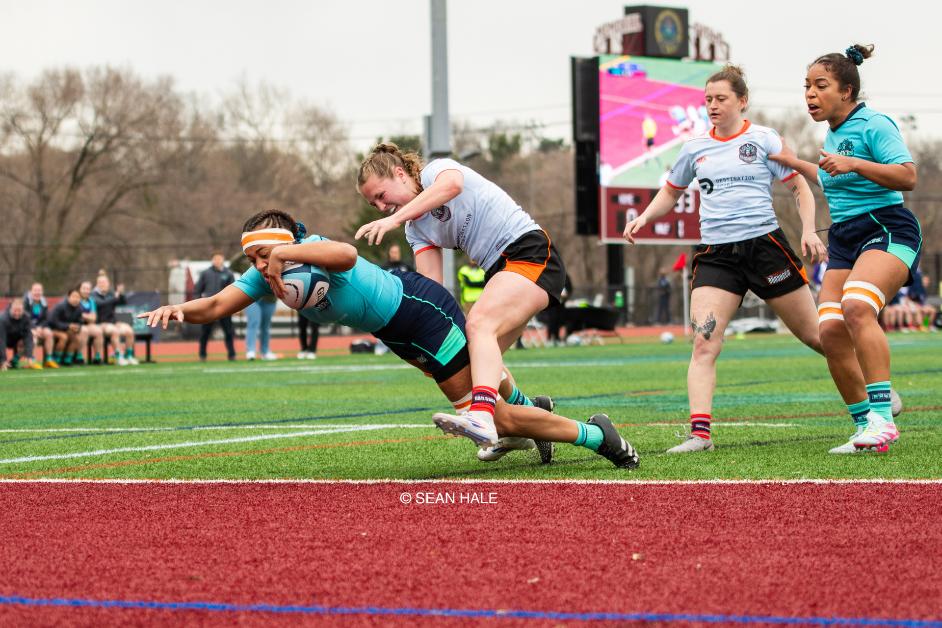
Women's Elite Rugby
Women's Elite Rugby is where fearless athletes and fierce action collide, proving that strength takes every shape. More than a game, it’s a movement driving progress for players, fans, and communities alike.
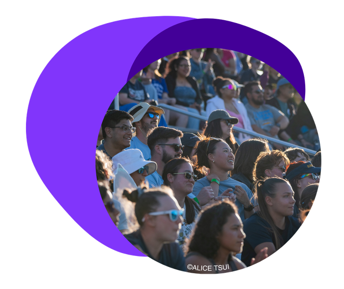
Women's Elite Rugby, Up Close.
Get Your Tickets.
Be there for every tackle, try, and triumph—reserve your spot now.
News & Updates
Rugby 101 As we gear up for the Legacy Cup, we want to make sure you’re fully prepared, so we’ve put together a quick Rugby 101 guide to help you get started!
Denver Onyx are headed to the Legacy Cup! Denver Onyx have secured their spot in the Legacy Cup on Saturday, June 29 at 2PM CT in Eagan, Minnesota . Get your tickets now to watch the Onyx compete live!
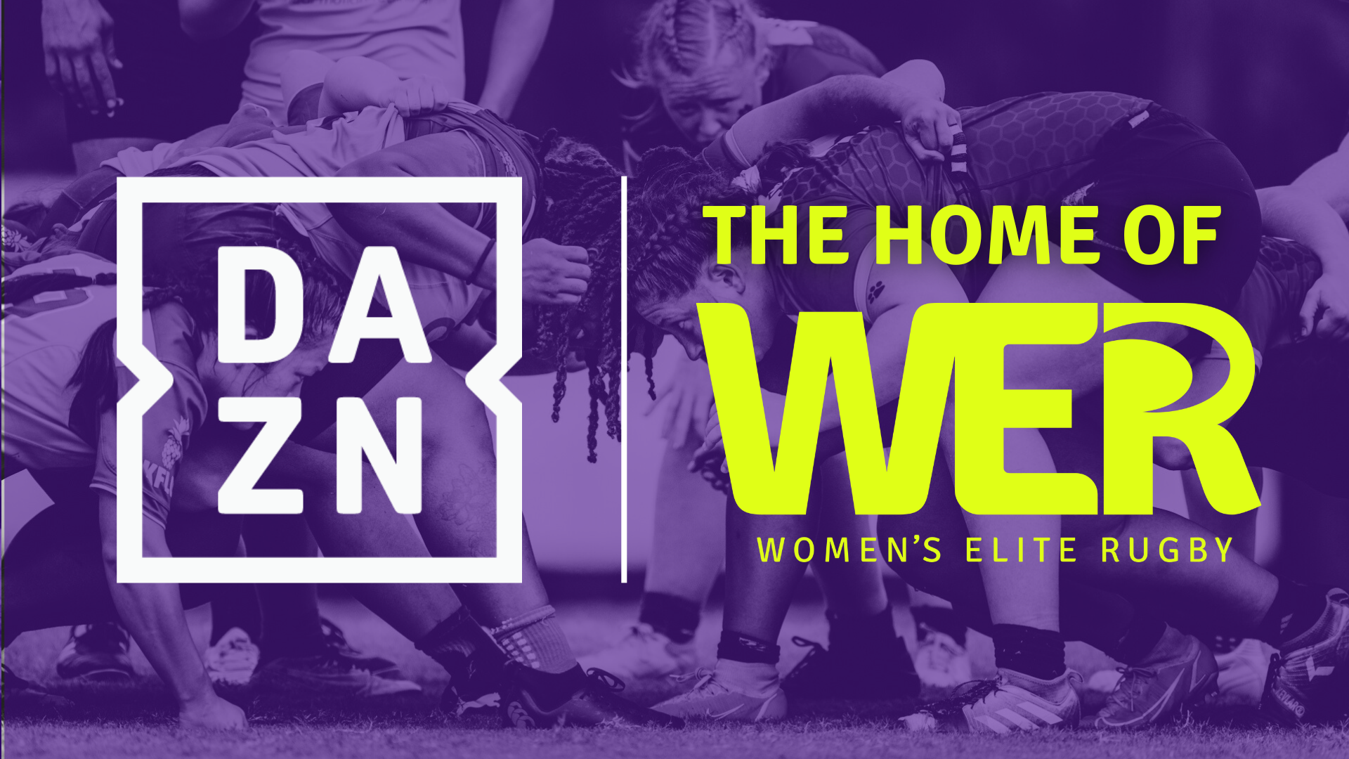
Our broadcast partnership with DAZN is being paused, with both sides aligned on the need to reassess the broadcast strategy moving forward. We appreciate DAZN’s early commitment, however challenges have meant we are pausing all broadcasts while we evaluate how to deliver the fan experience we promised. We are actively pursuing an alternative with the intention of being back on air as soon as possible for the remainder of the regular season and Legacy Cup. We will share updates as they become available.
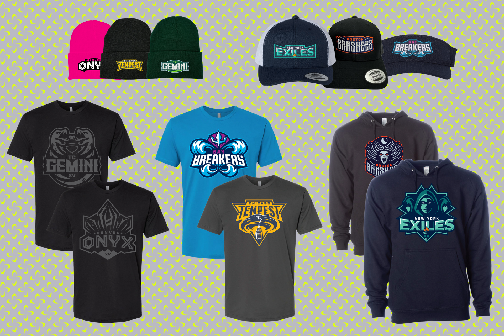
Shop Merch For Your Favorite Team
Never Miss An Update
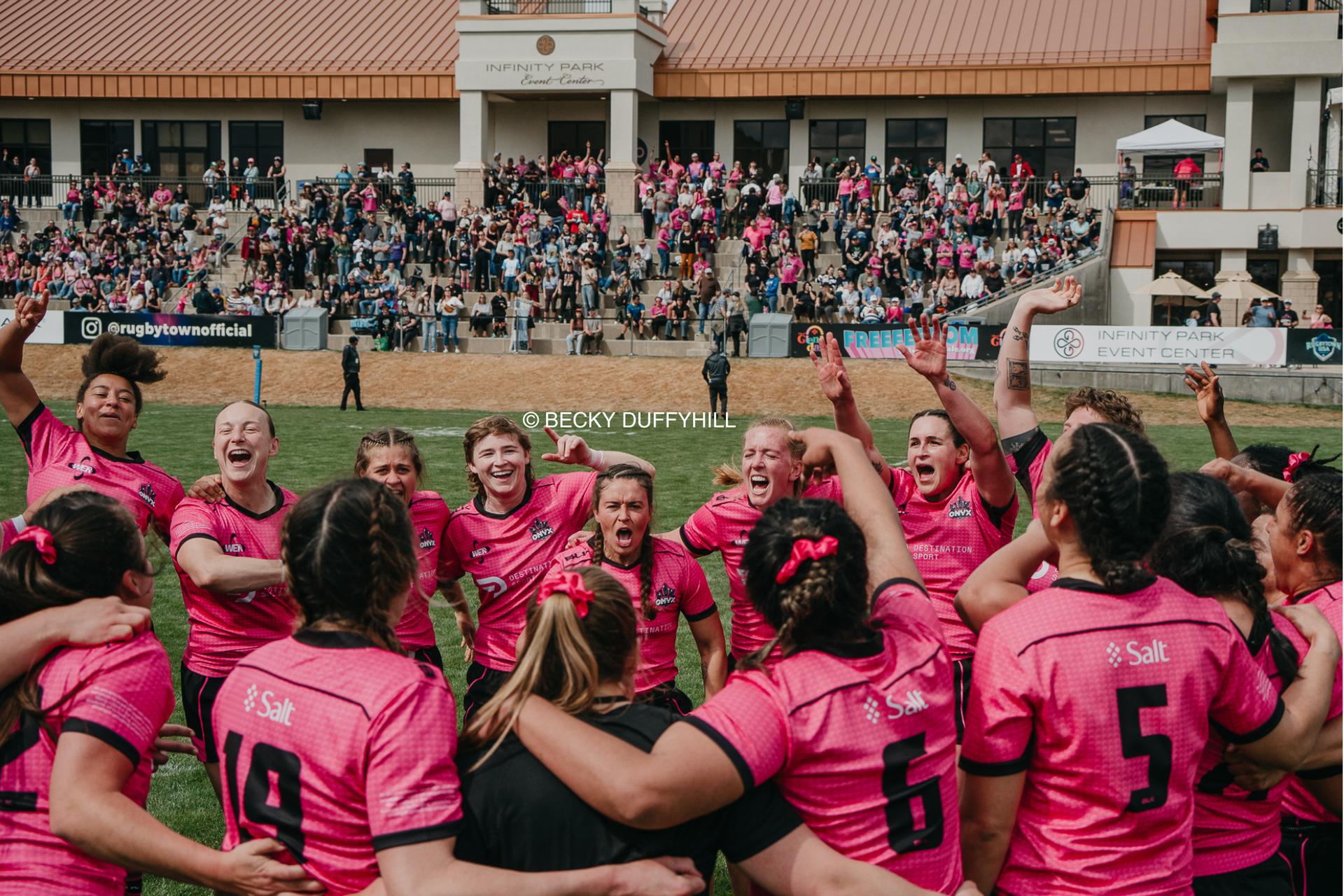
Witnessing history in the making 🏆
📸 @melpazphotos34
#rugby #womenssports #legacycup

Who will take home the Legacy Cup TODAY?!
It all comes down to this. The final clash. The ultimate prize. And what a prize it is 👀👇
Created by Colorado based landscape designer and former women’s rugby player Amy Root (@boardandwired), the Legacy Cup trophy is more than just metal, it’s a monument to the game’s past, present, and future.
🔥 In its second edition, the trophy builds on the original’s unfinished rugby ball form, evolving into a more complete and tightly layered structure just like the growing strength and unity of the women’s game.
⚙️ Curved steel blades, interwoven and riveted, symbolize resilience through connection, a tribute to generations of women who have built this sport together.
💥 Raw steel. Exposed welds. Brutalist beauty. This trophy does not just sit pretty it embodies the grit, toughness, and heart of rugby.
It all comes down to today Denver Onyx vs New York Exiles 🏆
📸 @melpazphotos34
#rugby #womenssports #legacycup #trophy

Congratulations to the amazing nominees for the Kathy Flores Heart of a Champion Award, presented in partnership with @wrcrarugby! The winner will be announced during today’s award presentation so stay tuned!
#rugby #awards #womenssports #kathyflores #uswrf #heartofachampion

EVERYONE WATCHES WOMEN’S SPORTS
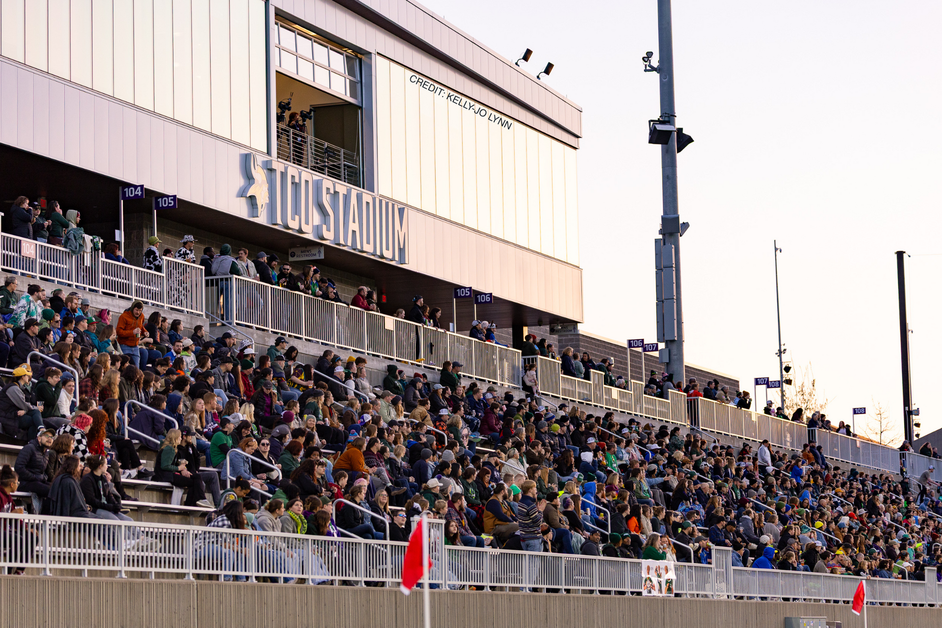
Who will be crowned the first-ever WER Champion? Tune in at 2PM CT today for the Legacy Cup final between 🪨@wer_denver and 🗽@wer_exiles
📺 womenseliterugby.us/watch-online
📍 TCO Stadium, Eagan, MN
🎟️ Link in bio
#rugby #womenssports #legacycup #everyonewatcheswomenssports
📸 @alexwohlphotography @rugby_sooz @kellyjosphotos @manishsportsphoto @als.photos96 @seanhaleyeah

The future of rugby is bright ✨
Scenes from today’s Legacy Cup youth clinic with a couple of special @wer_gemini coaches!
📸 @jkellmn
#rugby #womenssports #youthsports #clinic

1 day left. 1 shot at greatness. Who will claim the Legacy Cup?

2 days to go. 2 powerhouse teams. 1 unforgettable showdown.

RUGBY IS FOR ALL 👏
p.s. 3 days til Legacy Cup!

4 days until the Legacy Cup, so we’re dropping 4 quick facts you need to know before game day!

Save the date for this Saturday! Pryes Brewing is hosting a special Players Meet & Greet the night before the Legacy Cup. Come hang out, snap some photos, and grab autographs. We can’t wait to see you there!

5 days til Legacy Cup 👀 We’ve got 5 things you can do during Legacy Cup weekend! The schedule is stacked and ready for you

Legacy Cup Week is here! With just 6 days to go, we're giving you 6 reasons why you (and everyone else) should love rugby!

Take a moment to read our players’ reflections on what Juneteenth means to them. We hope today inspires you to reflect, learn, and celebrate the significance of this day.

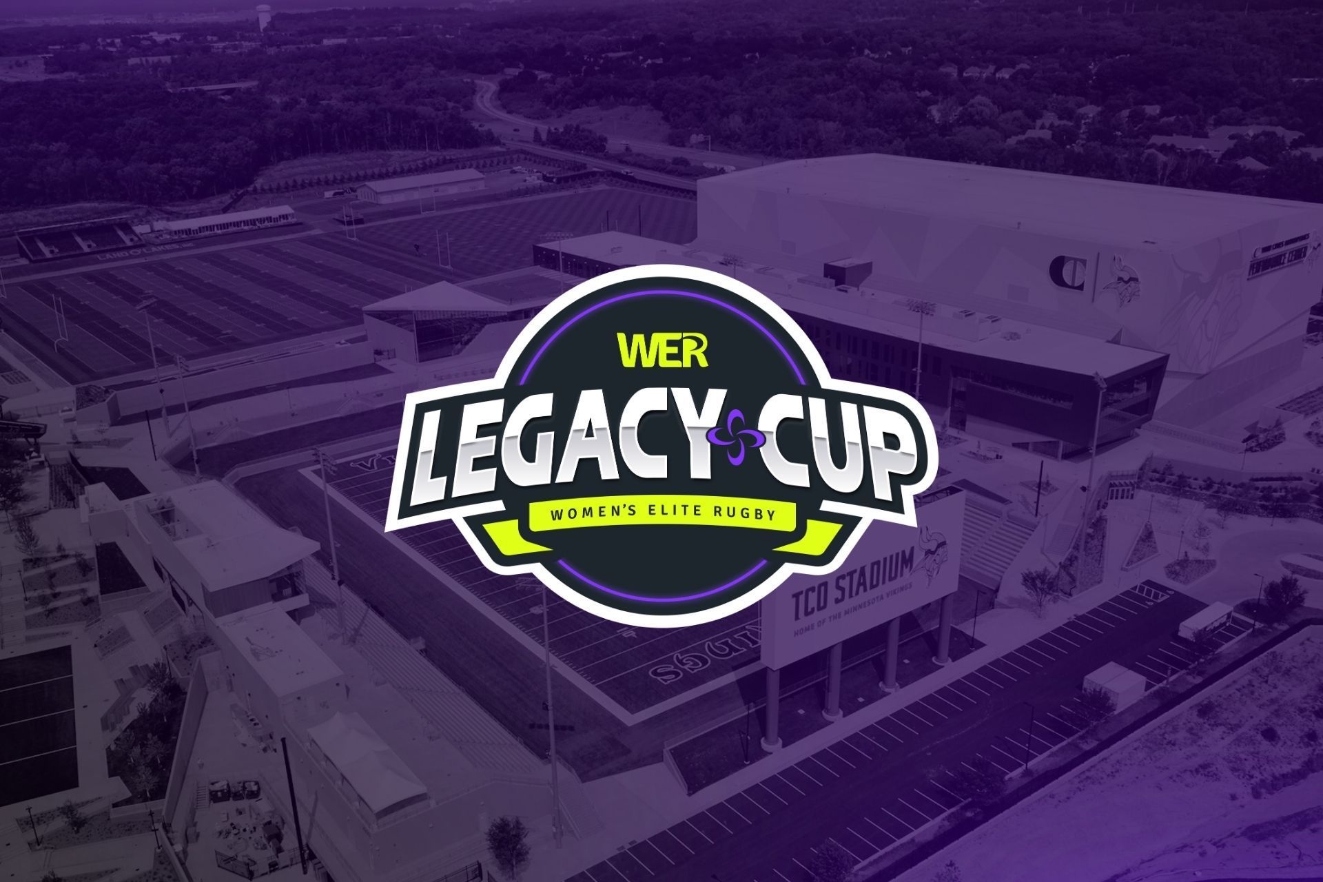
It all comes down to this! 🏆 The @wer_denver take on the @wer_exiles in our inaugural Legacy Cup on Sunday, June 29 at 2 PM CT!
🎟️ Grab your tickets at the link in bio
📺 Can’t make it? Stream it live on our website
Let’s make history. #LegacyCup #WomensEliteRugby #OnyxVsExiles

Came down to the wire but the Exiles squeak by the Breakers for the final spot in the Legacy Cup!
#rugby #womenssports standings

Results from the final round of action for the regular season ⬆️
📸 @alexwohlphotography
#rugby #womenssports #results

The @wer_denver and @wer_exiles are locked in for the Legacy Cup! Join us on Sunday, June 29 at TCO Stadium to catch all the action! Tickets at link in bio!

Announcing the Legacy Cup Clinic! Join us Saturday, June 28 in Eagan for a FREE clinic sponsored by Minnesota Sports and Events!
🕛 12–2 PM
👕 Free T-shirt
🎟 Chance to be a Player Pal at the Legacy Cup Game
💪 Learn new skills
🧒 Ages 5–18 | All skill levels | Coed
Don’t miss out — register now at womenseliterugby.us

Onyx clinches 1st place and the Breakers move into 2nd following strong wins in Week 12! The Exiles still have a chance to make it to the final, but it all comes down to this weekend 👀
#rugby #womenssports #standings

The results are in from Week 12, with Onyx and Breakers getting the wins in front of their home crowds 💜
📸 @lemoniceslushie
#rugby #womenssports #results

MUST. WIN. GAMES.
Every point counts as the race for the Legacy Cup tightens! Grab your tickets at the link in bio to catch every second or stream live on our website 🔗
#rugby #womenssports #schedule

Celebrate pride at our Pride Night matches this month! Grab your tickets at the link in bio and come out to show your pride 🌈
#rugby #womenssports #pride

Oh how the tables have turned! It’s madness in Week 11!!
📸 @lemoniceslushie @tamar.kreit @beckyduffyhill.creative @seanhaleyeah
#rugby #womenssports #WER

…I will still be going 🤭🤭
#WomensEliteRugby #LegacyCup #WomensRugby #WatchWomensSports #WomensSports

Shaking things up in Week 11!
Only 2 points separates 2nd from 4th in the fight for a spot in the Legacy Cup! Grab your tickets for the final two weeks of matches at the link in our bio 🔗
#rugby #womenssports #standings

Nail biters all around! Check out the results from Week 11 ⬆️
📸 @poojas_portraits
#rugby #womenssports #results

HAPPY PRIDE 🏳️🌈🏳️⚧️
There’s a place for everyone in rugby, and we’re so glad to have you!
#rugby #womenssports #pridemonth

May is Jewish American Heritage Month! As the month comes to a close, we’re honoring the rich history of Jewish American ruggers who have helped build the foundation we stand on today 💙
#rugby #jewishamericanheritagemonth

All 6 teams in action this weekend! A fight for the Cup, a Battle of the Midwest, and a scrappy rematch! Grab your tickets and tune in at the link in our bio to witness every hit live!
#rugby #womenssports #schedule

The countdown is on! Grab your tickets NOW and join us at the Legacy Cup!
🎟️ link in bio

With this weekend’s win, the Onyx have clinched their spot in the 2025 Legacy Cup!
Now the race is on for the final spot in the first-ever WER Championship! Who will be facing the Onyx on June 29th at TCO Stadium? Drop your guesses below 👇
And dont forget, tickets are on sale NOW for the Legacy Cup and the link in our bio!
#rugby #womenssports #standings

Close at the half, but Onyx and Breakers come out on top after a hard-fought 80'
#rugby #womenssports #results

In memory of those who have made the ultimate sacrifice.
#MemorialDay

Congratulations to the New York Exiles @forever_jamaica for being selected to Jamaica @ladycrocsrugby squad for their test match against Mexico today!
Tune in at 3pm ET at the link in our bio to catch our WER athletes face off! 🇯🇲 🇲🇽
#rugby #womenssports #jamaica #ladycrocs #testmatch

No shortage of games this weekend, with the top 4 teams in action! If you haven't gotten your tickets yet, be sure to head to the link in our bio to witness the hits live. For those at home, tune in on our website to watch all the plays 📺
And who's staying up late to catch our WER teammates take on the Black Ferns tonight? 🙋
#rugby #womenssports #schedule

We’re excited to share that both games this weekend will be live streamed for FREE at womenseliterugby.us/watch-online (link in bio)!
Please note that this weekend’s matches will feature live game and ref audio from on-field mics. As we work through this transition period, we know that the quality of the feed may not yet match what we are used to, but we are doing everything we can to provide fans, friends, and family the opportunity to watch your favorite athletes compete.
Thank you for sticking with us as we work to find solutions!
#rugby #womenssports #broadcast

🚨 ONLY A FEW GAMES LEFT! 🚨
The Women’s Elite Rugby season is heading into the final stretch and if you haven’t been to a match yet…this is your moment.
🏉 Big hits. Bold talent. Nonstop energy.
This is women’s rugby like you’ve never seen before and it's all wrapping up in June.
🎟️ Every ticket gets you closer to the action. Every game is a shot at history.
Don’t sit this one out.
✅ Pick your city
✅ Grab your seats
✅ Bring your people
This isn’t just sport. It’s the start of something massive.
Be there to say you saw it before everyone else caught on.
🎫 Tickets going fast ➡️ https://www.womenseliterugby.us
#WERugby #FeelEveryHit #WomensEliteRugby #BeThereOrHearAboutItLater

¡VAMOS SERPIENTES! 🇲🇽
Congratulations to all of our players selected to represent Mexico Rugby in their upcoming test match against Jamaica! Follow @rugby_mexico for details on how to watch tomorrow's game featuring your favorite WER athletes!
#rugby #womenssports #rugbyméxico #serpientes #rugbyfemenil

🚨 RUGBY RIVALRY ALERT! This Saturday, it’s Denver vs. Boston like you’ve NEVER seen before 💥
🏉 Onyx are throwing down with the Banshees in one of the most anticipated matchups of the season!
🗓 Saturday, May 24
🕒 1:00PM MDT
📍 Infinity Park, CO
🔥 This isn’t just a game. It’s history in the making. Women’s Elite Rugby is here and these teams are bringing real heat, real hits, and real heart.
🎟️ Don’t wait: Grab your crew and your tickets. You’ll want to say “I WAS THERE!” https://www.womenseliterugby.us
📲 Tag a friend. Share the hype. Be there.
#OnyxvsBanshees #WomensSports #GameChanger @wer_banshees @wer_onyx

The showdown is set for 2PM CT on June 29th! Don't miss the opportunity to watch the best of the best battle it out at TCO Stadium — grab you tickets NOW at the link in our bio 🎟️
📸 @gsabin
#rugby #womenssports #legacycup

The Legacy Cup watch is on! Who will be at the top of the table at the end of the season and earn the chance to compete in the first-ever WER championship?
Drop your guesses below!
#rugby #womenssports #standings

The home teams ruled this weekend with major wins in the northeast!
📸 @tamar.kreit
#rugby #womenssports #results

Broadcast may be down this weekend, but that doesn't mean the action stops! The Banshees are taking on the Tempest tomorrow, followed by an Exiles vs Gemini classic on Sunday. Be sure to snag your tickets at the link in bio to catch the games live!
And a bonus for all you rugby faithful: the Eagles will be playing down under and you can catch the match (not so) bright and early tomorrow!
#rugby #womenssports #schedule

The wait is over, WER is back tomorrow and Sunday! Let’s show up and show out.
📸 @kellyjosphotos

Gravity? Never heard of her
📸 @mikeconnersphoto23

Banshees return to #2 with a win over the Breakers, but the Onyx stay perfect at the top! Who will be the first to take down the leaders in pink? Comment your thoughts below 👇
#rugby #womenssports #standings

Onyx and Banshees getting it done on the road this week!
📸 @lemoniceslushie
#rugby #womenssports #results

Today, we're celebrating all of the amazing mothers who inspire us each and every day!

Due to unforeseen venue challenges, the remaining Bay Breakers home games will not be available for live stream on DAZN. We will notify fans of any updates on availability for on-demand viewing.
We recognize that this is disappointing for fans who want to watch our incredible athletes, and we encourage you to continue to attend games in-person to show your support!

Week 8 features another Friday night lights matchup in the Twin Cities with the Gemini taking on the Onyx, followed by an east/west showdown as the Banshees head to the Bay to face off with the Breakers!
Head to the link in bio to grab tickets!
#rugby #womenssports #schedule

The stage is set for the 2025 Legacy Cup! The top two teams from the regular season will battle it out on Sunday, June 29th at TCO Stadium for the championship trophy. Don't miss your chance to witness greatness live — sign up at the link in bio to access presale tickets starting next Monday.
#rugby #womenssports #legacycup #championship
📸 @kellyjosphotos

Onyx remain undefeated through week 7, but the chase is on! Check out the full standings ⬆️
#rugby #womenssports #standings

May the 4th be With You

Double-header Saturday featuring the Tempest in their final home match against the Breakers and the first Gemini vs Exiles showdown! And stay tuned on Sunday to catch the #1 taking on the #2 at the brand new Centreville Bank Stadium! All games streaming on @daznwsport and tickets available at the link in bio 🎟️
Bonus game tonight as the USA Eagles take on our northern rivals in a matchup for the ages!
#rugby #womenssports #schedule

The Onyx take over the top of the table with a decisive win over the Tempest in Week 6! Check our how your favorite team stacks up ⬆️
#rugby #womenssports #standings

Feeling the FOMO? Everyone’s talking about it. The hits. The speed. The fire.
Women’s Elite Rugby is that sport and if you haven’t seen it live yet…you’re already behind.
Real athletes. Real intensity. Real crowd energy. Don’t just scroll past it! You need to be there.
🎟️ Tickets on sale now - https://www.womenseliterugby.us/2025-schedule
👀 Your feed will be full of it either way. Might as well say you were there.
#WomensEliteRugby #FOMO #GameOn

Rivalry Reignited: Tempest vs. Onyx
This Saturday, witness the clash between two titans of Women's Elite Rugby. The Chicago Tempest's host the Denver Onyx in a showdown that's more than just a game - it's a battle for dominance.
📅 Saturday, April 26
🕑 2:00 PM CDT
📍 Northwestern Medicine Field, IL
Experience the intensity, the strategy, and the sheer athleticism as these teams go head-to-head. Whether you're a seasoned fan or new to the sport, this match promises edge-of-your-seat action.
🎟️ Tickets: Get Yours Now at Link in Bio
📺 Can't attend in person? Stream it live for free on DAZN
Join us and be part of rugby history in the making.
#WomensEliteRugby #TempestvsOnyx #RugbyRivalry #SupportWomensSports #LiveRugby @wer_tempest @wer_denver

Games on games on games! Congratulations to WER athletes who are on the🦅 @usarugby roster for the U.S. v Japan match.
Special cheers for @rica_baly of the @wer_denver making her 🇺🇸 National Team debut! 🩷
And of cource we have @wer_gemini v @wer_breakers tonight and @wer_tempest v @wer_denver tomorrow!

Another packed weekend kicking off tomorrow with the Gemini home opener against the Breakers, followed by a Tempest vs Onyx rematch on Saturday!
And for an extra treat — catch our Eagles and the USA Women's National Team take on Japan Saturday night on the RugbyPass app!
#rugby #womenssports #schedule

Friday night lights, fierce competition, and two powerhouse teams ready to battle it out.
TC Gemini vs. Bay Breakers
This isn’t just a match, it’s a statement on intent. TC brings the grit. Bay brings the speed. Every tackle, every sprint, every try counts.
📅 Friday, April 25, 2025
🕖 Kickoff: 7:00 PM CDT
📍 TCO Stadium, Eagan, MN
Whether you’re a longtime fan or new to the game, this is the one to watch. Feel the energy. Witness the hits. Support the women redefining rugby in the U.S.
🎟️ Tickets: Grab yours now - https://www.womenseliterugby.us/game/game_12
📺 Can’t make it in person? Catch it live on @daznwsport - for free. - https://www.womenseliterugby.us/watch
Let’s pack the stands and turn up the volume.
#WomensEliteRugby #TCGemini #BayBreakers #RugbyUSA #SupportWomensSports #LiveRugby @wer_gemini @wer_breakers

If you think you’ve seen tough, fast, high-impact sports then think again!
Women’s Elite Rugby is here, and it’s rewriting the rules. Every match delivers raw power, speed, and relentless drive. No timeouts. No holding back. Just 80 minutes of pure intensity.
This is the tournament you didn’t know you needed to see live...
🎟️ Tickets are on sale now - https://www.womenseliterugby.us/2025-schedule
Don’t miss your shot to witness the best.
#WomensRugby #EliteRugby #GameOn #SupportWomenInSports #RugbyUSA #werrugby #wer25

Exiles climb the ladder with a huge win over the Banshees in Week 5!
#rugby #womenssports #standings

All eyes on Boston this weekend as the classic rivalry heads to Veteran's Memorial!
Tickets available at the link in bio and stream live only on DAZN 🔗
#rugby #womenssports

Wishing all of our US National Team players and coaches good luck as they head into camp ahead of the Pacific Four Series!
The Eagles will be kicking off their Spring tour against Japan on April 26th in Los Angeles, and we can’t wait to see our WER athletes crushing it on the pitch 👊
#rugby #womenssports #uswnt

Denver continues to climb the ladder after Week 4! Check out the full table after this weekend's matches ⬆️
#rugby #womenssports #standings

The weekend is coming up quick — who are you rooting for?
Can’t make it live? Make sure to catch this week’s exciting match-ups on @daznwsport !
#WomensEliteRugby #watchrugby #WomensRugby #WomensSports #rugby

WE’RE BAAAACK! Our new store is up and running, so hear up with fresh merch and rep WER wherever you go 💜💛
Tap the link in bio to shop now 🛒 🔥
#rugby #womenssports #shop #merchandise

Due to technical difficulties at the venue, the game between Bay Breakers and TC Gemini will not be available to watch live this Saturday.
The game will still be played tomorrow at 5:30PM PDT and fans are encouraged to attend at Grape Bowl Stadium in Lodi, CA! We will keep fans updated on streaming availability for the match.
We apologize for the inconvenience and hope to have the issues rectified in time for the next Breakers home game.

🎟️ $15 tickets now available for kids, teachers, first responders and more! Head to the link in our bio to grab your tickets now.
📸 @seanhaleyeah
#rugby #womensports #WER #tickets

Our mid-season declaration period is open. Declarations will be addressed on a rolling basis.
https://www.womenseliterugby.us/declaration
#playrugby #womensports #rugby

We join in celebrating International Transgender Day of Visibility. Rugby is for everyone.
#tdov

Another try by MarCaya Bailous @_marcaya_b for @wer_tempest !
SCORE: Gemini 20 | Tempest 15
#WER #WomensEliteRugby #HERstory

A fourth try for @wer_gemini by Abbey Jacobs! @abbey_lynn_810
SCORE: Gemini 20 | Tempest 10
#WER #WomensEliteRugby #HERstory

MarCaya Bailous @_marcaya_b adds another try to the scoreboard for @wer_tempest!
SCORE: Gemini 15 | Tempest 10
#WER #WomensEliteRugby #HERstory

That’s a hat trick for #11 Kailynn Hampton @kailynnhampton! @wer_gemini adds another try to their score before the end of the first half.
SCORE: Gemini 15 | Tempest 5
#WER #HERstory #WomensEliteRugby

Kailynn Hampton @kailynnhampton scores @wer_gemini second try of the match!
SCORE: GEMINI 10 | TEMPEST 5
#WER #HERstory #WomensEliteRugby

Are you new here? Don’t worry, all are welcome in rugby 💜💛
#rugby #WER #womenssports

Boston Banshees taking home the first-ever WER win with a penalty try, bringing the final score to 29-27!
#WER #WomensEliteRugby #HERstory

Adriana Castillo @infearinfaith with her first score for the Exiles!
#WER #WomensEliteRugby #HERstory

Cheta Emba @chetaemba bringing Boston to the lead with her first try!
#WER #WomensEliteRugby #HERstory

Yeja Dunn @yeja16 with their first try for the Banshees, narrowing the gap with 20 minutes left!
#WER #WomensEliteRugby #HERstory

Jenny Kronish @jennykronish with the second try for the Banshees!
#WER #WomensEliteRugby #HERstory

Caoimhe O'Sullivan Roche @djquivii with another Exiles try before the half!
#WER #WomensEliteRugby #HERstory

Tess Feury @tessfeury with an amazing second try for the Exiles!
#WER #WomensEliteRugby #HERstory

Lauren Ferridge @lferridge12 scoring Boston Banshees first try of the day!
#WER #WomensEliteRugby #HERstory

Misha Green-Yotts @mishag12 with the FIRST TRY in WER history!
#WER #WomensEliteRugby #HERstory

Don't miss a match! The highly-anticipated WER season kicks off tomorrow and all games are available to be streamed for free on @daznwsport
Tune in Saturday at 3PM EDT to catch the inaugural northeast matchup between @wer_exiles and @wer_banshees ! On Sunday, @wer_tempest take on @wer_gemini at 1PM CDT in a midwest showdown you won't want to miss 👊
#rugby #womenssports #streaming

Have you gotten your tickets yet? Tickets to all 30 games are on sale NOW. Whether you are a solo supporter or a fan club, we've got you covered! So what are you waiting for? Secure your seat today. Comment below and let us know who you're watching with. https://f.mtr.cool/opdhfjjcqu

Opening weekend is finally upon us! Don't miss a once-in-a-lifetime opportunity to support the beginning of a movement and witness the action right before your eyes! Tickets are still available at the link in our bio 🎟️
#rugby #womensrugby #sports #womenssports #tickets #games #openingweekend #kickoff

Broadcast info coming soon, and trust us - it’ll be worth the wait 👀
#broadcast #rugby #womenssports

Game-changing partnership, game-changing boots! ⚡️ IDA Sports, the leader in footwear designed specifically for women, is now the official footwear partner of Women’s Elite Rugby. Because the best deserve gear built for them from the ground up. Let’s lace up, level up, and make history together!
#womenssports #womensrugby #footwear #sportsbiz

Happy International Women’s Day! WER is built on the foundation laid by so many incredible women+ at the @wpl.rugby, and we continue to celebrate the long and rich history of women’s+ rugby, those who are currently hard at work to turn a dream into reality, and all of the young girls and women who continue to break barriers and take women’s+ rugby to new heights!
Don’t forget to show your support by purchasing tickets for the inaugural season at the link in our bio!
@allbluesrugby @ahwrfc @beantownrfc @chicagonorthshorerugby @cograywolves @lifewestrugby @nyrcwomen @dcfuries @tcamazonsrugby @sdsurfersrugby @orsuwomxn @keystonerugbyclub
#internationalwomensday #iwd2025 #womenssports #womensrugby

On the @togethxr calendar. Rugby is everyone’s new favorite sport! 💜🏉💛
💙🌊 🩶👹 💛🌪️ 🩷🏔️ 🩵🗽 💚🐍

Supporting athletes means learning about the differences they face and how you can empower them and help them navigate challenges that come their way.
#sport #womensports #rugby @muslimahrugby

@feisty_media identifying WER on their 8 THINGS YOU NEED TO KNOW ABOUT WOMENS SPORTS this week.
#womensports #rugby #sports

The 2025 WER venues are finally here !!
Let us know which one is your favorite 👀👀
#WomensRugby #WER #WatchRugby #RugbyEvolved #WomensSports

The matchups are set for the inaugural season ➡️ Grab your tickets now at the link in bio and watch history unfold right before your eyes! 👀
#WER #rugby #womensrugby #sports #womenssports #schedulerelease

Happy Valentine’s Day to our biggest crushes 🤭 😍

On International Girls and Women+ in Science Day, we’re celebrating all of the girls and women+ in the rugby community who are breaking barriers in STEM! 🔬 Check out a few of these amazing athletes+ ⬆️
#WomeninSTEM #WER #rugby #womensrugby #sports #womenssports

Join us in celebrating National Girls and Women in Sports Day by supporting our Foundational Five athletes who are raising the standards of the game and continuing the growth of women’s+ rugby!
All photos provided by athletes.
#NGWSD #FoundationalFive #WER #rugby #womensrugby #womenssports #sports