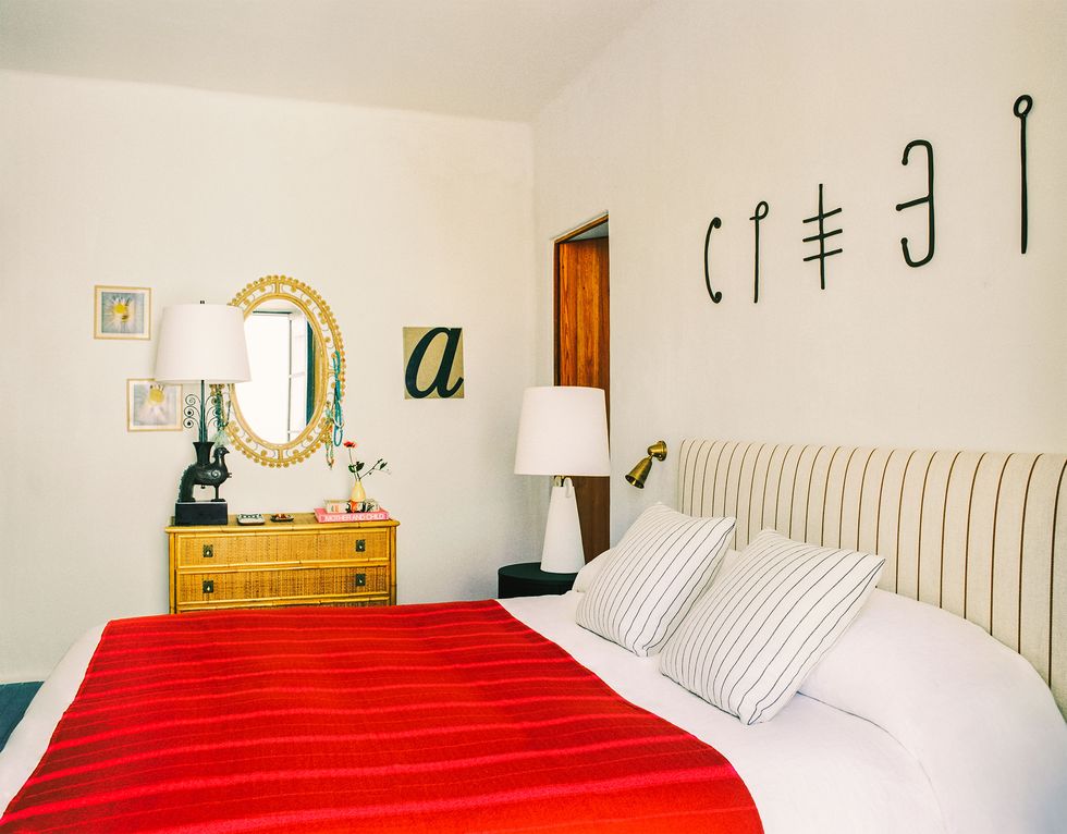
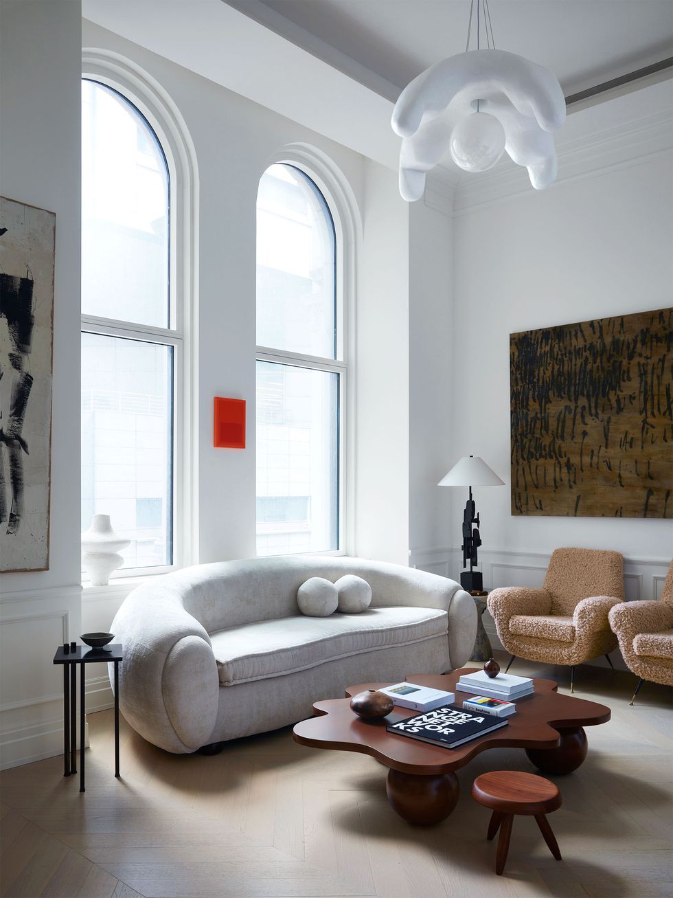
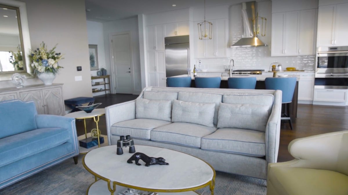
“The ‘unexpected red’ theory is basically adding anything that’s red, big or small, to a room where it doesn’t match at all and it automatically looks better,” Brooklyn-based interior designer Taylor Migliazzo Simon says in a green-screen TikTok video, as photos of rooms featuring a pop of red flash behind her. Since Migliazzo Simon posted the video on January 16, it has received nearly a million views.
The theory, which sounds simple enough, has sparked thousands of hot takes. There are those, like interior designer Samantha Stathis Lynch, who don’t see red as the panacea Migliazzo Simon suggests. “When used correctly, red can be sophisticated and playful, but don’t expect to throw a red pillow on a sofa and voilà, your room is suddenly perfect,” Stathis Lynch asserts. Others, including interior designer Kishani Perera, feel that adding a red accent is one of the oldest tricks in the book: “It’s quite funny to call it a ‘theory’ because it’s something that has been used in good design for ages. A pop of red is classic and timeless in my opinion!”
In the video’s comment section, many have chimed in to cite color theory as the explanation, to which Migliazzo Simon replies cheerfully, “We may be late to the party but we’re here!! ❤️💜” And since we’re here, we asked color experts to unpack the science.
Perhaps unsurprisingly (color is their life’s work after all), each one bristled a bit at the semantics, echoing some version of executive director of the Pantone Color Institute Leatrice Eiseman’s response: “I have never seen, read, or researched anything that justifies this sweeping generalization.” She adds, “Red might be used as an accent, but it is a stretch to say it makes any room look better.”
Other experts went on to explain what Migliazzo Simon and other aesthetes have clearly intuited. “It comes down to hue, value, and chroma,” says Sheri Peterson, designer and president of the North American chapter of the International Association of Color Consultants (IACC). “In the photo examples, the correct hue, value, and chroma of red was used with the other colors on the color wheel. Colors that are complementary, analogous, etc., are most pleasing to the eye when they are of similar value and chroma.” (For the uninitiated, value refers to the lightness or darkness of a color, while chroma is the saturation or brilliance.)
Consult a color wheel and you’ll notice the combinations seen in the video come together. For example, turquoise and red are complementary, while red, purple, and pink are analogous. “Red is typically an uplifting color,” says Peterson. “But I could achieve the same effect with orange, yellow, purple, or any other color if I’m using correct color theory relationships.”
Then, there’s the psychology and physiology of color. Massimo Caiazzo, the designer and vice president of the Italian chapter of the IACC, advises using red “with caution” as “red causes a slight acceleration of the heartbeat, an increase in blood pressure and respiratory rate.” That’s because it takes our bodies more energy to look at something red, than it does other colors, he elaborates.
This physiological response to red influences our behavior. “I’ve stayed away from using bright red accents in my own work simply because I’ve always felt that the color is jarring,” home decor expert Alexandra Gater observes. “[Red] can be quite polarizing,” states interior designer Carrie Moore. “We don’t encounter many clients who ask for it, so it finds its way into our work less often.” Designer Regan Baker recommends small doses to clients “because the color is so bold and intense—skinny pieces of furniture, small accents, or a single piece, such as a sconce, frame, or mirror.”
Some posit that the popularity of the TikTok theory is exactly proportional to how underutilized the hue has been in the past. “It’s less of a color theory moment, and more that red has not been trending for quite a long time,” color expert Maria Killam suggests.
Interior designer Drew Scott approaches this moment with zeal, adding: “For so long we were seeing white or monotone spaces and now the introduction of a pop of color is back! I love any unexpected introduction of color to a room, especially red.”
Migliazzo Simon agrees. “My point was more so the intentionality and fun of incorporating red in an item, like a picture frame, light fixture, or lampshade, when the usual color choice for those items would be neutral,” she tells ELLE DECOR. “Red is an iconic and timeless color, and adding a ‘pop of red’ is nothing new, so I hope the unexpected red theory is seen as more of a rule of thumb rather than a passing trend.”
Of course, she still gets all the credit for getting the party started.


